Funny connection you made with the everything everywhere all at once movie with twine, which is another good example of entertaining storytelling. Lovely you got to live out your YouTube dreams in this blog. You were able to put your skills to use. I think I need to try this ramen now. Beautiful tangent about BTS’s endorsement of the ramen. You put your all into your video, it looks delicious. I’m wondering do you have any experiences of really bad stories. Or any stories that aren’t super sad but you still enjoy?
Category: Assignment 3 – Final Review – Module 3-5 Blog Posts and Comments

In this module, we looked at techniques for telling effective stories.
I do not think I am good at telling stories. Though I haven’t had to form stories in this sort of educational format where I put more thought into my structure and presentation. I think naturally I fill my stories with a very personal touch and get my audience involved. I can create suspense surely but I also think it helps if the story I am telling is inherently suspenseful which is probably why I am telling it. It would be harder to make a boring story or a story that hides a lesson to be suspenseful. That takes a lot more construction and manoeuvring on the side of the storyteller.
In my life, I have met a lot of people who are horrible at telling stories and I remember that much better than all the good stories. When I think of stories too I think much more about books and movies that stick with me. There is a quote from someone that I love and it goes like, I can’t remember the books I have read any more than the meals I have eaten, yet they have made me. I think that speaks a lot to me and the power of stories, I really agree with it and especially because I have a horrible memory. Also, in terms of teaching and being able to absorb lessons from stories comes from this idea. If the audience can tell you are trying to bake some sort of meaningful lesson into a story it becomes boring or condescending quickly I think. But when the story is really good and uses those different storytelling techniques, you can’t even tell that you are learning something and this leads to a greater chance the audience will take something away from it. It is like when you have to hide your dog’s medicine in a treat or something like that.
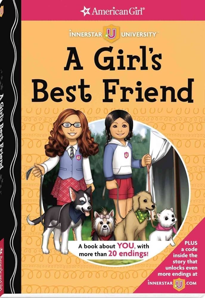
I used to love branched narrative stories when I was a kid or how I knew them as, choose your own adventure books. I think it was American Girl that made these books for little girls where you would have to make hard decisions that would lead you down different paths. I remember I always read one about some sort of dog adoption storyline. Those are always great. I remember books like these being very popular with the kids. The format provides a more active way for the reader to be involved and be able to make decisions about the story.
The Bill Gates Malaria Ted Talk actually made me gasp when I read that he opened a jar of mosquitoes at the end. That for sure really resonated with people, very much show don’t tell.
Using Twine at first was overwhelming but once I got the bare basics using different resources I was able to begin. I knew I wanted images though because playing this little game with sole text is quite boring. I just wanted to write something fun and silly to experiment with the program. It is really fun to use actually. One of the videos I watched said something like the program makes you think in a non-linear way which is true and cool. It makes you think about your story in a different way and come up with new branches and diversions.
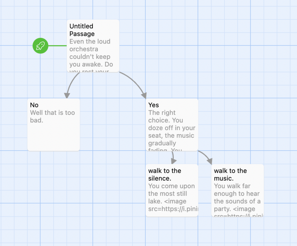
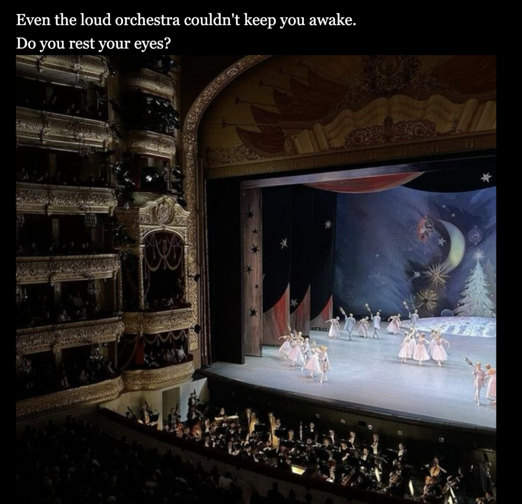

If you say no:
If you say yes:


To silence:

To music:


I find watching videos much better for learning things like this, the cookbook for Twine was kind of outdated, not all the information worked on this current version of the program and I didn’t want to read all that text. However, I was able to easily find these YouTube videos that guided me much faster.
So I learned how to start working with Twine with this video:
and learned how to import images with this video:
Then I created my learning video on my phone. I created a script and a storyboard.
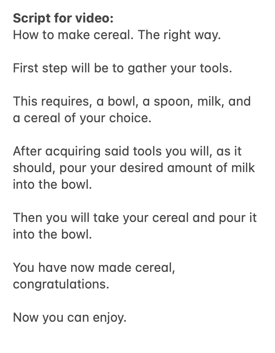
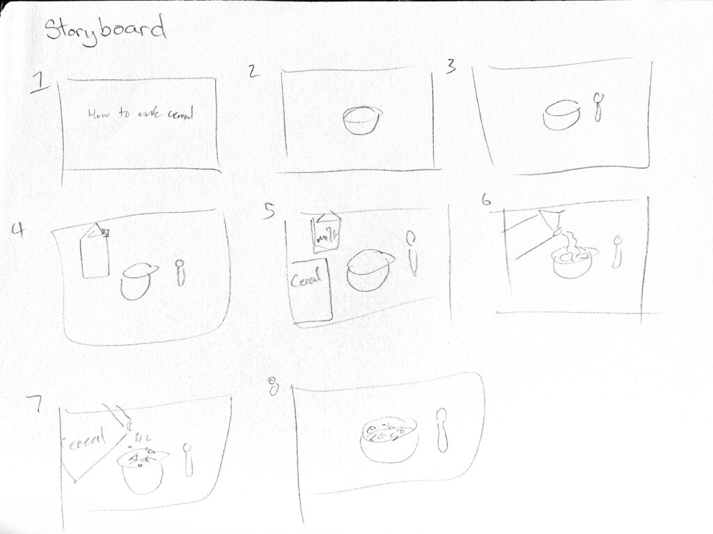
Here is the link to my video: https://vimeo.com/1030568031?share=copy
When filming on my phone vs a screencast I forgot about how much the camera moves. I made sure to use the camera stabilizer on imovie to still my video. I think if I was to make a more clean video I would need a tripod, or even better what I would need is another person to hold the camera.
My comment on Natasha’s Blog:
Funny connection you made with the everything everywhere all at once movie with twine, which is another good example of entertaining storytelling. Lovely you got to live out your YouTube dreams in this blog. You were able to put your skills to use. I think I need to try this ramen now. Beautiful tangent about BTS’s endorsement of the ramen. You put your all into your video, it looks delicious. I’m wondering do you have any experiences of really bad stories. Or any stories that aren’t super sad but you still enjoy?
Hi Natasha,
I liked your little questions after each section of your blog. It was like a fun little test to see if I read what you wrote which is funny.
I love the idea of using AI to make quizzes for you based on your course materials. That’s such a smart way of using the tool. It reminds me of the app Quizlet that everyone used back in high school. Need to start doing that.
Nice noticing that simply by looking at your transcripts you could tell what classes you were actively or passively learning in. I think that’s a correct observation and would be true to anyone.
Do you see any way you could increase your active learning in classes like computer science where you feel you don’t have an innate interest or the material is simply dry?
Hi Markus,
I like how you phrased your revelation on inclusive design, realizing that you should start creating something with the anticipation of needing to accommodate different needs instead of taking something that already exists and trying to make it accessible after the fact. What you are essentially doing is using the backwards design method we learned about in the last module to now think about creating things for accessibility, so that’s great!
I’m glad text-to-speech tools worked out for you and that you found them helpful. I cannot absorb information from just listening, and, as you mentioned, the robotic voice doesn’t help much either.
And yes, the wave accessibility tool was disappointing. We had a very similar experience.
To answer your question, there are many tools online that can check how your work might look to someone who is colourblind. Some of them can be helpful in different ways, such as checking the contrast of your text or how different colours will read. I use these mostly for design purposes.
When you say you will try to use generic and plain text, what do you mean exactly? If by that you mean limiting yourself and your writing to very simple sentence structures and less flowery language I think you would be doing a disservice to yourself and others. Making something accessible doesn’t mean dumbing it down. But if you meant like fonts then yes I agree haha.

In this module, we looked at design principles and accessibility!
Wave check:
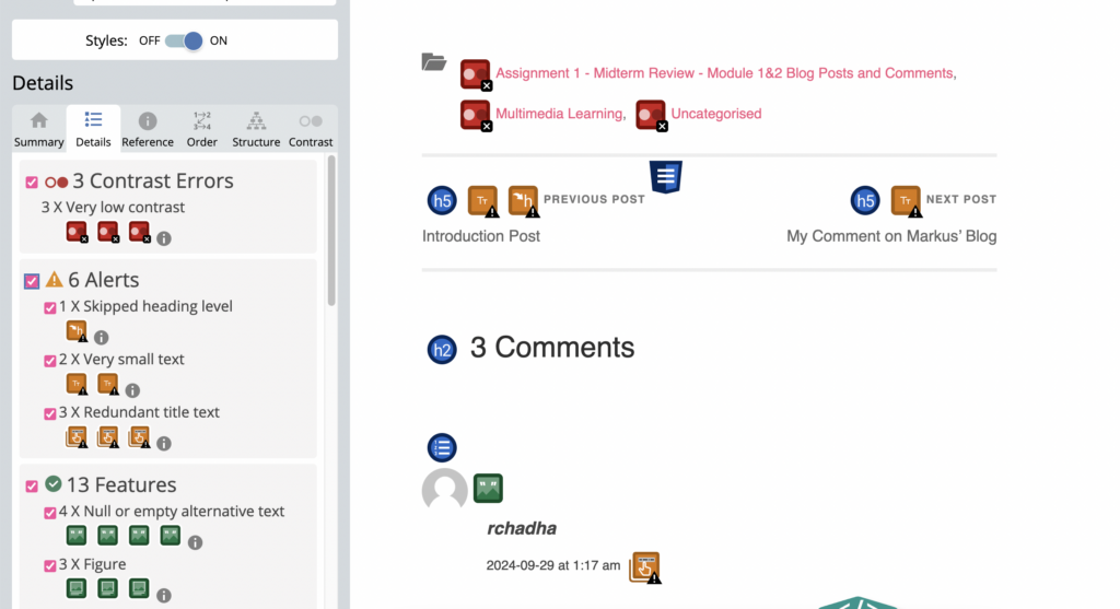
Firstly I put my first blog post into Wave Check and most of the corrections it gave me were quite misguided. They were things I couldn’t change like things that are part of the website and links to my other blogs at the bottom. It told me there were structural issues and said I had redundant titles on the date and time of people’s comments.
So this program can’t really do anything for me in this context. I have a better eye than a machine. The only thing I could take away from this and consider is labeling my image at the beginning but it is just decorative and doesn’t really need a description. It’s an interesting program but limited in its abilities. It reminds me of last week’s AI module and how we need to continue to supervise these kinds of things.
I could see how in a different context on a different type of example this could help to realize how your work looks to someone with different abilities though. It is nice to have a different set of eyes to look at your design choices in terms of accessibility.
Text to speech:
The example of the fonts being read aloud in a tweet was interesting, I didn’t know using weird fonts like that messes up some voice readers. That should really be tuned.
I used Read-Aloud to read out some of the text from my blog. I’ve used systems like these before to read my work. It is a good way to spot any grammatical errors in your writing. It makes it easier to spot missing punctuation or run-on sentences when you hear someone speak them, even if it is a bit stilted. I find too that when reading my text and the way I like to write in my voice, the robot sometimes can’t pick up on that. It is kind of like Grammarly as well where I will get corrections for my text that just change my text in a way that isn’t easier to understand but the voice decided is better, which can be frustrating. I can write a perfectly fine sentence but a robot could read it in the wrong rhythm or something like that.
I sometimes find text-to-speech hard to follow along with. Speed wise and tone wise. So I don’t use it often for actually understanding a piece of text, I’d rather read it myself where I can set the pace but I do use it to check errors in my writing or to simply hear what my writing sounds like and for that it is helpful. I also see how this could be helpful for students who can’t read for long periods of time and find it easier to listen. These programs are already so good for that but It’d be nice in the future when these voices become less robotic and more fluid for that purpose.
Canva Infographic:
I decided to make my infographic about my anthropology of sound class where we learned about sound walks and conducted one of our own. I thought I could lay out the main principles of a sound walk in this layout.
I’ve used Canva before so I’m familiar with it. I followed the design principles we learned about in this module to make it. I kept my design simple with minimal colours and fonts.
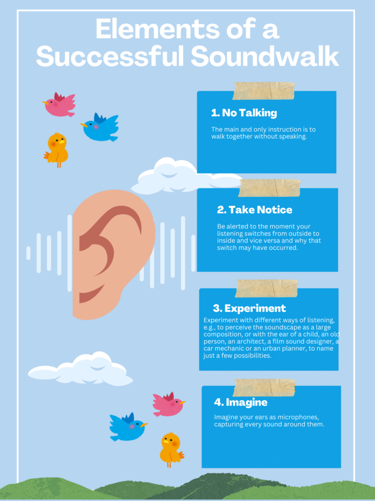
And harkening back to Mayer’s principles of multimedia, I knew adding visuals along with the text is a way of communicating more intuitively. So adding the images of an ear and sound waves is just a small way of connecting ideas from the text to the visual.
In terms of accessibility, captions are certainly the most prominent example. I rarely ever watch media without them. I think in terms of learning environments and the universal design for learning the guideline of engagement is prevalent in a lot of my courses. Teachers often offer flexibility in ways of presenting course work for example. Someone might prefer an essay while someone else might do a class presentation, these sorts of options for students I’ve seen in many of my courses and I find them very helpful. They allow everyone to choose how they best can present their learning.
My comment on Markus’ blog:

This module examined the different ways active learning is incorporated into effective lesson plans. We were also introduced to HP5, a new tool for creating interactive learning activities.
Several new foreign teaching vocab were thrown at me in this module including but not limited to, backward design, Merrill’s five principles of instruction, Bloom’s Taxonomy and scaffolding.
Although these terms were all new to me, like other terms I’ve learned in this course, they end up being quite simple ideas maybe even seemingly obvious ideas of teaching and learning that are organized into these unfamiliar structures.
Backward design, was the most straightforward to me. Keep the goal in mind before building the lesson plan so you know how to attain your goal. Makes sense. This is something I know I encounter all the time when looking at my courses’ syllabi. Those always include things like learning outcomes and objectives that the students should accomplish and then the lessons that will lead to those goals. I also see backwards design in courses like this one where many of our assignments act as sort of building blocks for our final assesment goal.
Merrill’s Five Principles of Instruction have to do with initiating hands-on problem-solving and learning. It is about making lessons meaningful to learners like relating assignments to real-world events, or issues.
Learning what Scaffolding is brought back many memories of elementary and high school, where I feel this method was used a lot in settings like science class or art. For example, the teacher would first demonstrate a lab before assigning us to do the same thing individually. This learning design I find myself particularly connected to and I know works well for me.
Simulation was brought up a lot in these as an example of how media can enrich a learning experience. This is quite an interesting idea for the future when things like vr get more advanced and we can see how it is used in a classroom setting.
My experience using H5P wasn’t half bad.
I can see myself using it again if need be. It’s a handy way to enrich a video.
Here is the lesson design template I filled out about the interactive video I made. It details the learning outcomes and activities required to be successful in viewing an interactive quiz video like the one I made:
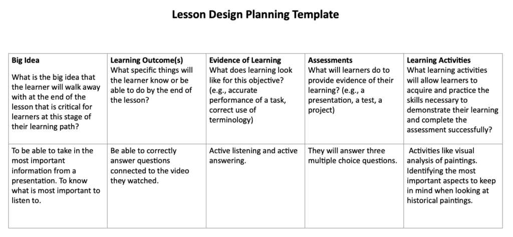
I really wanted my video to be related to art history so what I did was I found an exhibition tour video from the MET explaining a pair of portraits. I took a snippet of this longer video and turned it into an interactive video.
I thought I could take this video and make it more of an active learning experience with H5P. Really it is an active listening quiz. So students have to really open their ears and be able to show their listening by answering the questions that interrupt the video.
The interactive video I created using H5P:
Sources:
My comment on Natasha’s Blog: