EDCI 337: Assignment 3: Rich Multimedia Lesson
Andrea Torre, Natasha Au-Duong, Raghav Chadha, & Markus Sekhon
This lesson is designed for middle school students. However, some learners may require additional support in completing certain activities and accessing some of the interactive resources or tools. To ensure everyone can fully participate, we will provide extra guidance, simplified instructions, and alternative resources where needed.
Overview:
This week, we will dive into the world of colour theory and explore how it surrounds us in everyday life. From the colours we wear to the ones we see in nature and art, understanding colour helps us make sense of the world and express ourselves creatively. Some examples of where we see colour theory in action include:
- Mixing paints in art class to create new shades and tones
- Recognizing how certain colours like red or green influence emotions in media
To help us deepen our understanding of colour, we will watch videos, play interactive games, create our colour wheels, and design palettes based on emotions and themes. Get ready to see the world in a whole new way!
Lesson Objectives:
By the end of the week, you will be able to:
- Understand the colour wheel, including primary, secondary, and tertiary colours.
- Identify how colours interact and form harmonies like complementary, analogous, and triadic.
- Recognize the emotional impact of colours through colour psychology (e.g., red for passion or anger, blue for calmness).
- Apply your knowledge of colour theory to create your own colour wheel.
Read/Watch – Let’s get started!:
You might be wondering… what even is colour theory? Explore the content below to grasp the basics:
Read: A Quick Lesson in Colour Theory (5 min)
Watch: Colour Theory for Noobs (8:53 min)
Watch: Elements of Art: Color (4:12 min)
Watch: Color Theory – A Beginners Guide (10:44 min)
Watch: Markus’ video on the basics of colour theory (10 min)
Colour in Media:
Watch: When the director happens to be an expert in colour theory (11:24 min) – a video on the use of colour in film
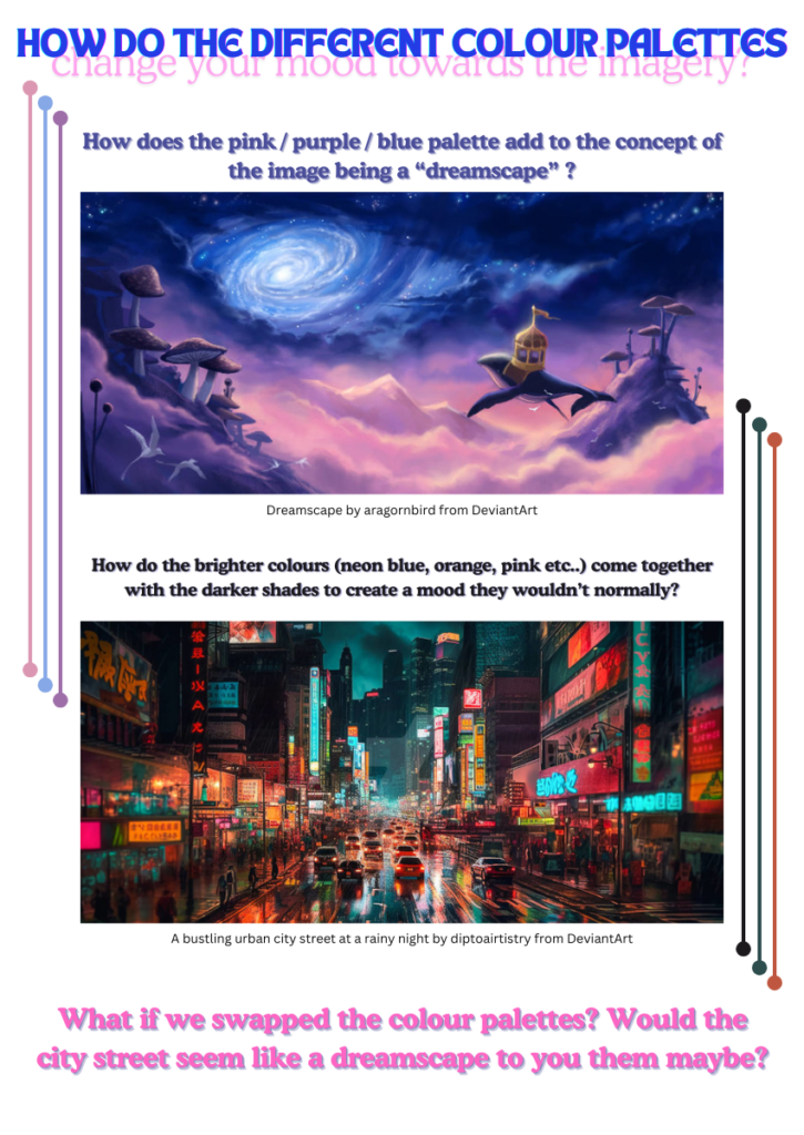
Colour Psychology:
Watch: Every Color Psychology Explained in 8 Minutes (8:13 min)
Watch Natasha’s intro video to colours and their meanings (8 min)
Content – Let’s Play!:
Pop quiz! – A multiple choice and true/false quiz on the basics of colour:
Let’s match fruits with their colours! – A matching game dragging images:
Colour theory drag and drop game! – Testing your knowledge on triadic, analogous and complementary colours:
If you are not done playing yet here are some more games to try out!:
Play: Colour Game – A colour matching game
Play: True Colours – Hue the paintbrush will help you review how to mix colors to make new ones. Then, you can take a fun quiz!
Time To Make Your Own Colour Wheel!
Now that we’ve learned all about colour theory, time to break out the paintbrushes and mix some colours!
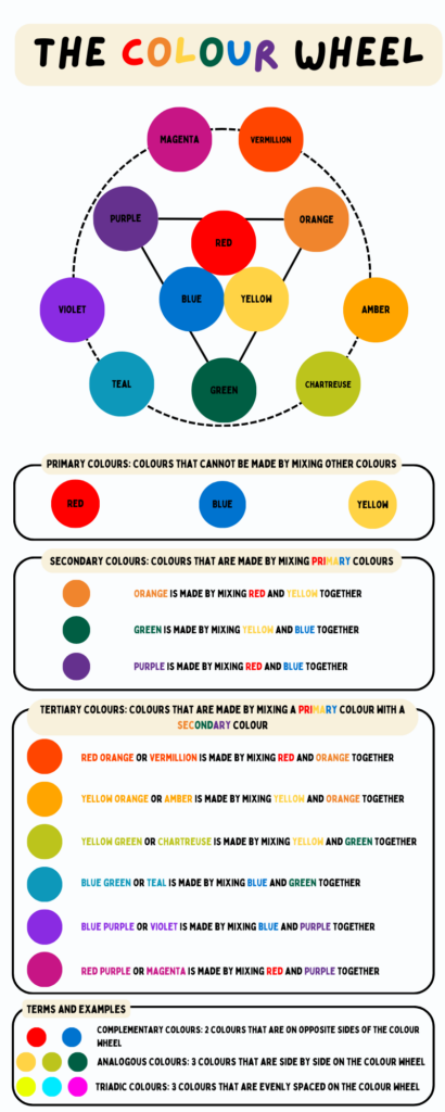
You can download this colour wheel template below:
If you need extra guidance on how to start your colour wheel you can watch these videos:
Watch: The Color Wheel (3:39 min)
Watch: How to Paint an Accurate COLOUR WHEEL (Step by Step) (6:53 min)
Let’s reflect:
- When you worked on creating your own colour wheel, what did you find challenging or exciting?
- Have you ever noticed how certain colours make you feel in your everyday life? What’s an example?
- Give some examples of a recent film that uses colour to further portray meaning.
- If you could invent a new colour that no one has ever seen before, what would you name it, and how would it make people feel?
- Certain people have reported they can hear colours, known as sound-colour synesthesia, have you ever experienced anything like this? If not, think about a song you really enjoy and the imagery you associate with it, what are the colours of this scene? How do you think these colours are assigned to this scene by your associations with the song?
- Focus on the colours in your home right now… how does their make up impact your mood? Do you think the colours in your environment can be changed to influence your mood for the better?
- Do you think everyone sees colours the same as others? I.e. is the blue I see actually your red? Why or why not?
- Do you think colour psychology would work similarly for people experiencing colour blindness? Why or why not?
To do this week:
- Complete the Read/Watch activities
- Complete the Content – Let’s Play! activities
- Complete the colour wheel activity
- Consider at least one example of a colour that influences emotions in your everyday life.
Reflection:
How each team member contributed to the project:
- Natasha
- Designed the color wheel infographic, created the color and meaning infographic, produced the color and meaning video. She also crafted a reflective question for the “Let’s Reflect” section.
- Andrea
- Structured the overview, created the lesson objectives, planned the colour wheel activity, organized the lesson plan table, wrote game and content descriptions and formatted and published the blog.
- Raghav
- Created “Exploring Colors Theory and Understanidng Colors” H5P Quiz , Co-Authored the “Theories and Principles Guiding Our Lesson” section, reflective questions, created to-do list section, Co-Authored Reflection section
- Markus
- Created the “Colour theory” video, crafted reflective questions, created colour palette infographic and created the “Fruits and Their Colours” and “Colour Theory Drag-and-Drop” H5P games.
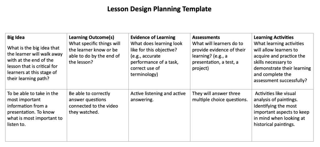
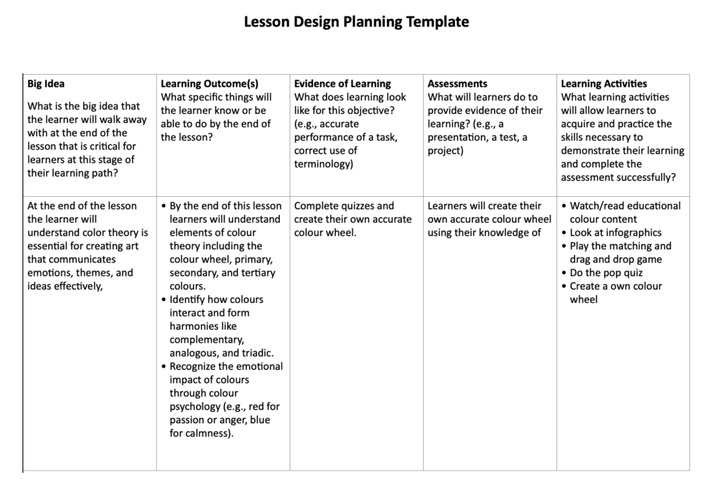
The lesson planning template:
The tools we used to create our media:
- Colour and meaning infographic – Canva
- Colour wheel infographic – Canva
- Colour and meaning video – iMovie
- Colour theory video – iMovie
- Pop quiz – H5P
- Matching game – H5P
- Drag and drop game – H5P and Canva
The media we included from other sources:
- Photo by Amelia Verhaert on Pinterest – for our cover art
- Images in Markus’s video from – https://artfulhaven.com/color-theory-for-artists/
- Colour wheel template – https://persialou.com/blank-color-wheel-worksheets-free-printables/ – an easy and accessible way for learners to start their colour wheel with more guidance
- The Color Wheel – youtube video for explaining the colour wheel
- How to Paint an Accurate COLOUR WHEEL (Step by Step) – youtube video on how to paint a colour wheel
- Colour Game – an extra colour matching game
- True Colours – an extra painting game
- Every Color Psychology Explained in 8 Minutes – youtube video for learning colour psychology
- When the director happens to be an expert in colour theory – a video on the use of colour in film
- A Quick Lesson in Colour Theory – website on colour theory
- Colour Theory for Noobs – youtube video for learning colour theory
- Elements of Art: Color – youtube video for learning hue and saturation
- Color Theory – A Beginners Guide – youtube video for learning colour theory
The principles, theories and techniques that we studied this term that we have followed in our lesson:
Our lesson on color theory was designed to hit all the major points from the course, and honestly, it’s super cool how much we managed to tie in. Everything from the videos to the activities, and even the reflective prompts, was carefully planned to align with the instructional theories we’ve been learning. Here’s how it all comes together.
First off, Cognitive Load Theory was a big part of how we structured the whole thing. Color theory can feel pretty overwhelming if you’re thrown into it all at once, right? So, we started with the basics like primary colors, secondary colors, and so on, before moving into things like harmonies and emotional associations. The idea was to keep the complexity manageable (intrinsic load) while avoiding unnecessary distractions (extraneous load). For example, the color wheel infographic was designed with clean, soothing colors and simple shapes to keep it visually appealing but not overwhelming. In the “Read/Watch” section, videos introduced concepts in logical order, ensuring learners could grasp one concept at a time without feeling overloaded. It clearly grouped concepts like primary, secondary, and tertiary colors in a logical flow. The reflection questions in “Let’s Reflect”, like “What emotions do you associate with blue?” helped make the material stick by connecting it to personal experiences (germane load).
The videos we created perfectly aligned with Dual Coding Theory, which emphasizes using both visual and verbal cues to reinforce learning. In the “Colors and Their Meanings” video, we paired verbal explanations of colors with relevant visuals. For example, red was associated with love using a heart icon and anger using a red-faced character. This combination allowed learners to process information more effectively. Similarly, the color wheel video introduced warm and cool colors using relatable metaphors like the ocean for cool tones and campfires for warm tones. These approaches ensured that learners could connect abstract concepts with tangible examples, making the learning experience richer and more memorable.
We also incorporated external YouTube videos into the “Read/Watch” section, like the beginner’s guide to color theory and videos exploring color psychology. These videos tied seamlessly with the course content by demonstrating foundational and applied aspects of color theory. The use of external content allowed us to expand our instructional methods while maintaining a balance between multimedia learning and engagement.
We leaned heavily on Mayer’s Multimedia Principles throughout the project. The Coherence Principle was followed by avoiding irrelevant details in both the videos and the blog. For example, the color wheel infographic only included essential information, such as how primary and secondary colors mix to form tertiary colors, without unnecessary decorative elements. The Segmenting Principle was evident in both videos and blog sections, which were broken down into manageable parts. Learners could watch short segments on topics like complementary colors or warm and cool tones, allowing them to digest the material at their own pace. In the videos, the Signaling Principle was applied by using visual cues like, we made sure to color the text in the color wheel infographic to match the actual color, like writing “red” in red, which helps connect the name with the color itself. It also ties into what we learned about Mayer’s Dual Coding Theory, basically making it easier for people to process and remember. Plus, it just looks super clean and makes the infographic way more engaging.
When creating the activities, we intentionally incorporated Merrill’s First Principles of Instruction. The blog activated prior knowledge through prompts in the Overview section, encouraging learners to think about colors they encounter in daily life. The demonstration was a key feature in the color wheel video, where we visually showed how primary colors combine to create secondary colors. The “Make Your Own Color Wheel” activity served as the application phase, giving learners a hands-on opportunity to apply what they learned. Integration happened through the reflection prompts in “Let’s Reflect,” where learners were asked to connect their learning to personal experiences, such as recalling how certain colors influenced their emotions.
We also incorporated Principles of Active Learning. The hands-on activities like the interactive games in the “Let’s Play” section, Exploring Color Theory and Understanding Colors“ quiz encouraged learners to actively engage with the material rather than passively consuming it. This approach ensured deeper learning through exploration and application.
Universal Design for Learning (UDL) was another guiding principle for the entire lesson. We made sure to offer multiple means of engagement, representation, and expression. The reflection prompts allowed for a more introspective approach. The infographics provided visual learners with clear, accessible representations of concepts like color harmonies and emotional associations, while auditory learners could benefit from the narration in the videos.
To make learning even more inclusive, we applied the Redundancy Principle by avoiding excessive text when using narration and graphics in the videos. For instance, instead of crowding the screen with definitions, we used visuals and concise voiceovers to keep the cognitive load low while maximizing comprehension.
Finally, our lesson plan followed the Backward Design Framework. We identified the ultimate goal which was understanding and applying color theory and then worked backward to structure the content. Each activity, from creating a color wheel to reflecting on emotional color associations, was carefully aligned with this goal, ensuring every component supported meaningful learning.
References:
https://www.colormatters.com/color-and-design/basic-color-theory

