In this module, we looked at design principles and accessibility!
Wave check:
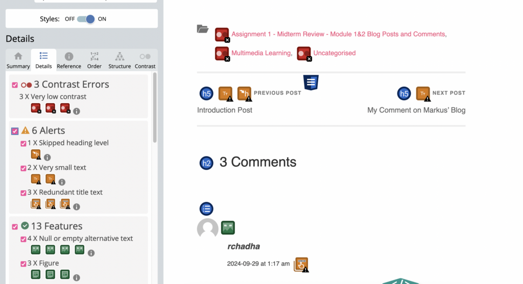
Firstly I put my first blog post into Wave Check and most of the corrections it gave me were quite misguided. They were things I couldn’t change like things that are part of the website and links to my other blogs at the bottom. It told me there were structural issues and said I had redundant titles on the date and time of people’s comments.
So this program can’t really do anything for me in this context. I have a better eye than a machine. The only thing I could take away from this and consider is labeling my image at the beginning but it is just decorative and doesn’t really need a description. It’s an interesting program but limited in its abilities. It reminds me of last week’s AI module and how we need to continue to supervise these kinds of things.
I could see how in a different context on a different type of example this could help to realize how your work looks to someone with different abilities though. It is nice to have a different set of eyes to look at your design choices in terms of accessibility.

Text to speech:
The example of the fonts being read aloud in a tweet was interesting, I didn’t know using weird fonts like that messes up some voice readers. That should really be tuned.
I used Read-Aloud to read out some of the text from my blog. I’ve used systems like these before to read my work. It is a good way to spot any grammatical errors in your writing. It makes it easier to spot missing punctuation or run-on sentences when you hear someone speak them, even if it is a bit stilted. I find too that when reading my text and the way I like to write in my voice, the robot sometimes can’t pick up on that. It is kind of like Grammarly as well where I will get corrections for my text that just change my text in a way that isn’t easier to understand but the voice decided is better, which can be frustrating. I can write a perfectly fine sentence but a robot could read it in the wrong rhythm or something like that.
I sometimes find text-to-speech hard to follow along with. Speed wise and tone wise. So I don’t use it often for actually understanding a piece of text, I’d rather read it myself where I can set the pace but I do use it to check errors in my writing or to simply hear what my writing sounds like and for that it is helpful. I also see how this could be helpful for students who can’t read for long periods of time and find it easier to listen. These programs are already so good for that but It’d be nice in the future when these voices become less robotic and more fluid for that purpose.
Canva Infographic:
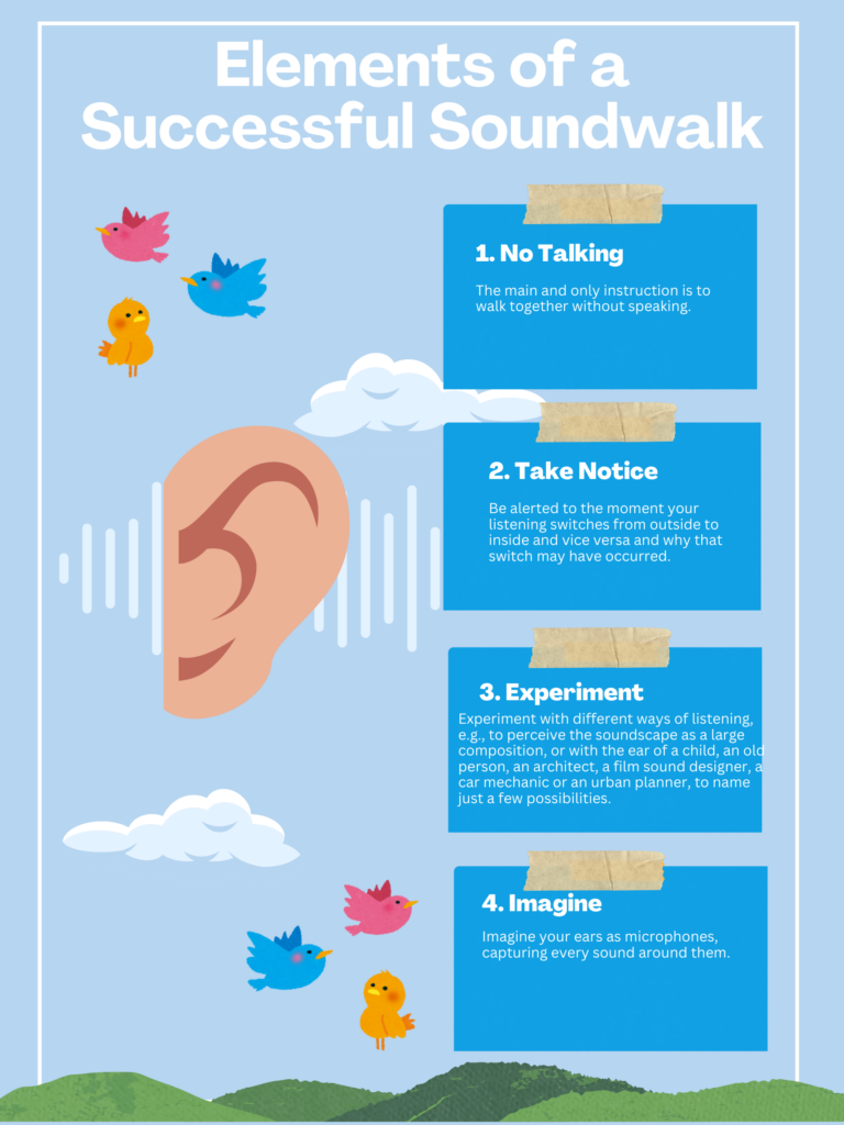
I decided to make my infographic about my anthropology of sound class where we learned about sound walks and conducted one of our own. I thought I could lay out the main principles of a sound walk in this layout.
I’ve used Canva before so I’m familiar with it. I followed the design principles we learned about in this module to make it. I kept my design simple with minimal colours and fonts.

And harkening back to Mayer’s principles of multimedia, I knew adding visuals along with the text is a way of communicating more intuitively. So adding the images of an ear and sound waves is just a small way of connecting ideas from the text to the visual.
In terms of accessibility, captions are certainly the most prominent example. I rarely ever watch media without them. I think in terms of learning environments and the universal design for learning the guideline of engagement is prevalent in a lot of my courses. Teachers often offer flexibility in ways of presenting course work for example. Someone might prefer an essay while someone else might do a class presentation, these sorts of options for students I’ve seen in many of my courses and I find them very helpful. They allow everyone to choose how they best can present their learning.
My comment on Markus’ blog:
Hey Andrea! I really enjoyed reading your post, and it’s super cool how you tied everything together. Your experience with the WAVE tool was so relatable! It’s like these automated checkers sometimes flag stuff that doesn’t even need fixing. I loved how you pointed out the limits and the need for that human touch, which totally connects with what we talked about in the AI module.
I totally agree with you on how text-to-speech can benefit students who find reading for long periods tough.
The soundwalk infographic is so well done! The design is simple and super effective. The colors you chose are super soothing to the eyes, making it inviting and easy to follow. The bold titles and spacing also help guide the reader’s attention naturally. Great job!